Horaman No 1. features the debut appearance of Horaman, a masked superhero created by Australian writer and film producer Shayne Armstrong in 2019. The comic is written by Shayne, and illustrated by fellow Australian Glenn Manders.
Born in 1970, Shane has worked for years in the film and television industries – notably as a writer on such films as The Darkness (2016), Bait (2012) and Acolytes (2008). With much of his writing being done in collaboration with fellow Australian SP Krause.
Born in 1982, Glenn has been a mainstay of the Australian art and design scenes for years now. Running his Bad Teeth empire since 2005, working as a commercial designer and also releasing toys – such as his much loved Cheestroyer soft vinyl toy.
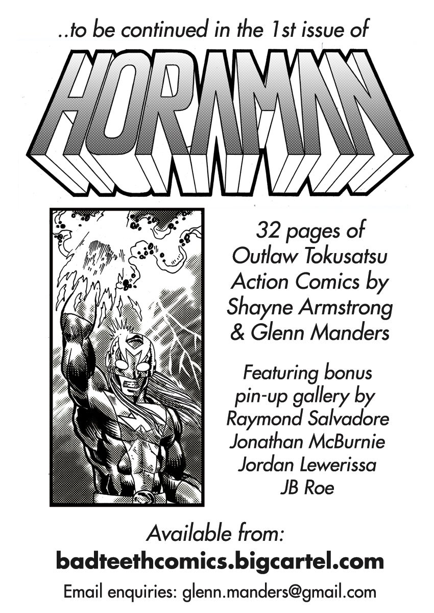
The Specs
- Title = Horaman No. 1
- Date of Release = March 2020
- Publisher = Black Bar Comics X Bad Teeth Comics
- Artist = Glenn Manders
- Writer = Shayne Armstrong
- Number of Pages = 32 with heavy-stock front and back covers.
- Format = The cover, internal front page and back pages are colour. With the 19 of the 20 pages of narrative being black and white / greyscale.
- Print Number = First printing of 100 copies.
- Print Format = Laser photocopy.
- Paper type = Standard photocopy paper.
- Printed In = Brisbane, Queensland, Australia.
- Height = 21cm
- Width = 14.75cm
- Thickness = 0.4cm
- Character Created By = Horaman created by Shayne Armstrong in 2019.
- Release Price = US$ 7 + shipping.
The Narrative
The comic tells the tale of a nameless mutant monster attacking a city and eventually being slain by our titular hero Horaman. As the city’s human citizens watch on, in awe and adoration.
Like classic monster tales – Horaman No. 1 is light on story and heavy on action. Only hinting at Horaman’s origin and providing a cursory glance of the universe in which the comic is set.
In this way, the comic is more teaser tale than origin story. It reveals the protagonist, his abilities and the world of the comic but not much else.
The comic does however hint at a horrible secret that Horaman is hiding, concerning his origin and even his very humanity…
How was he created? Who does he work for? And is he man… beast… or something else entirely?! Questions that will undoubtedly be pondered and answered in later issues!
The Art
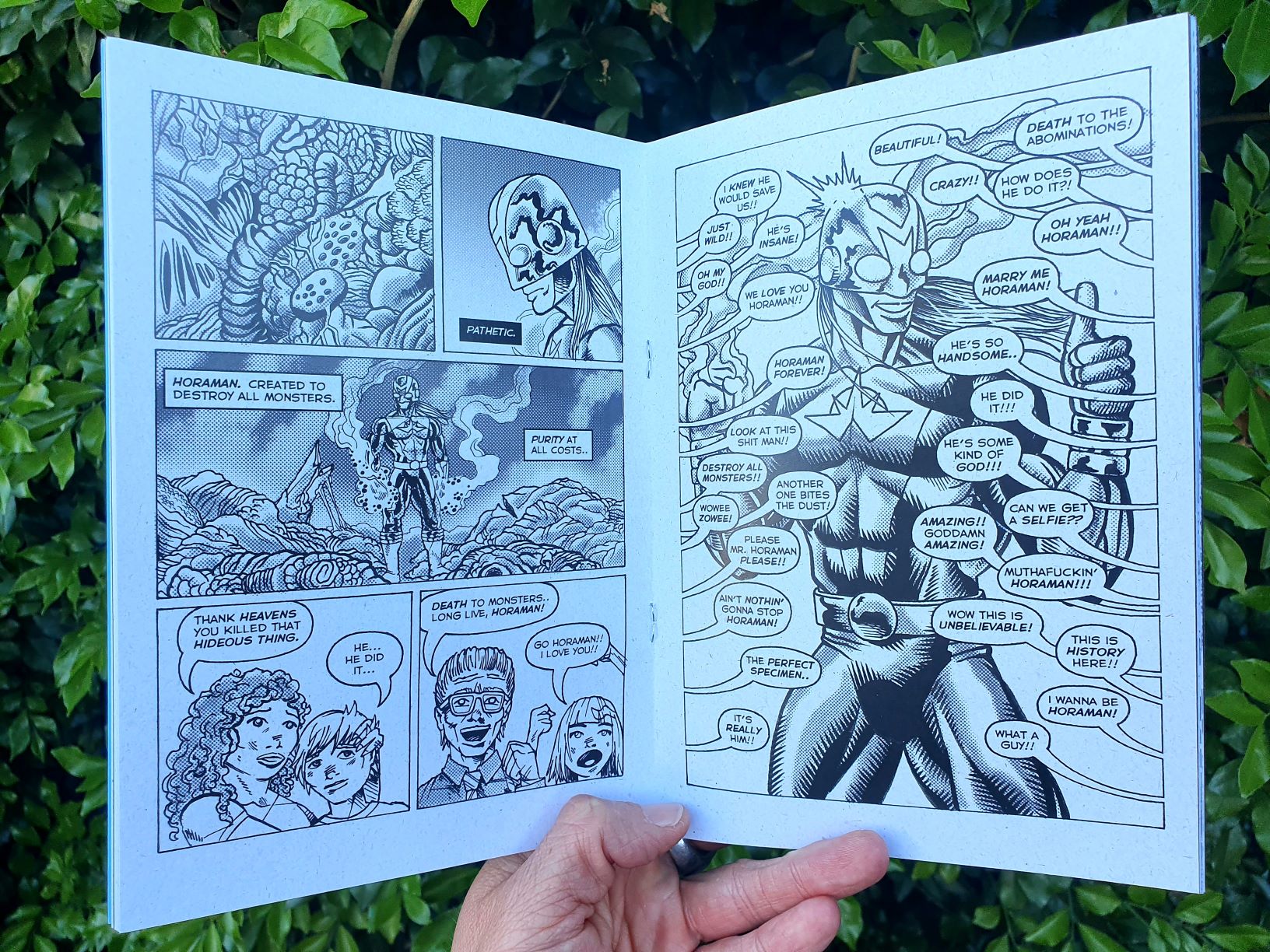
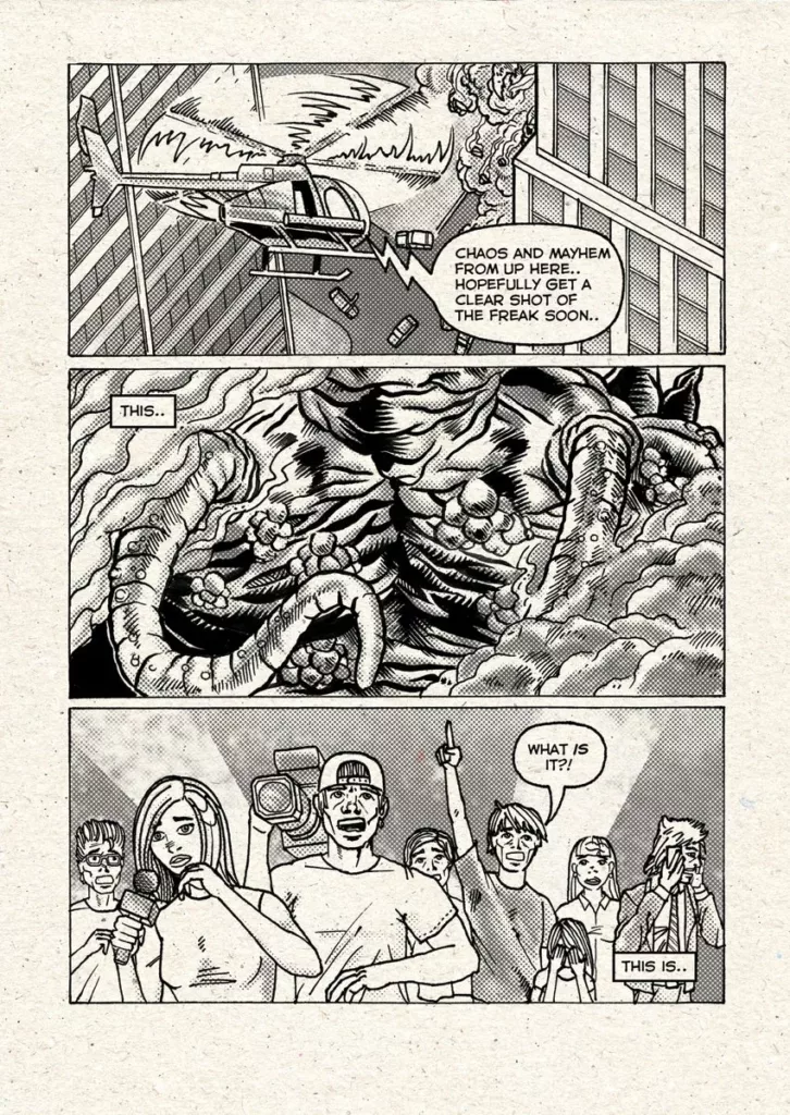
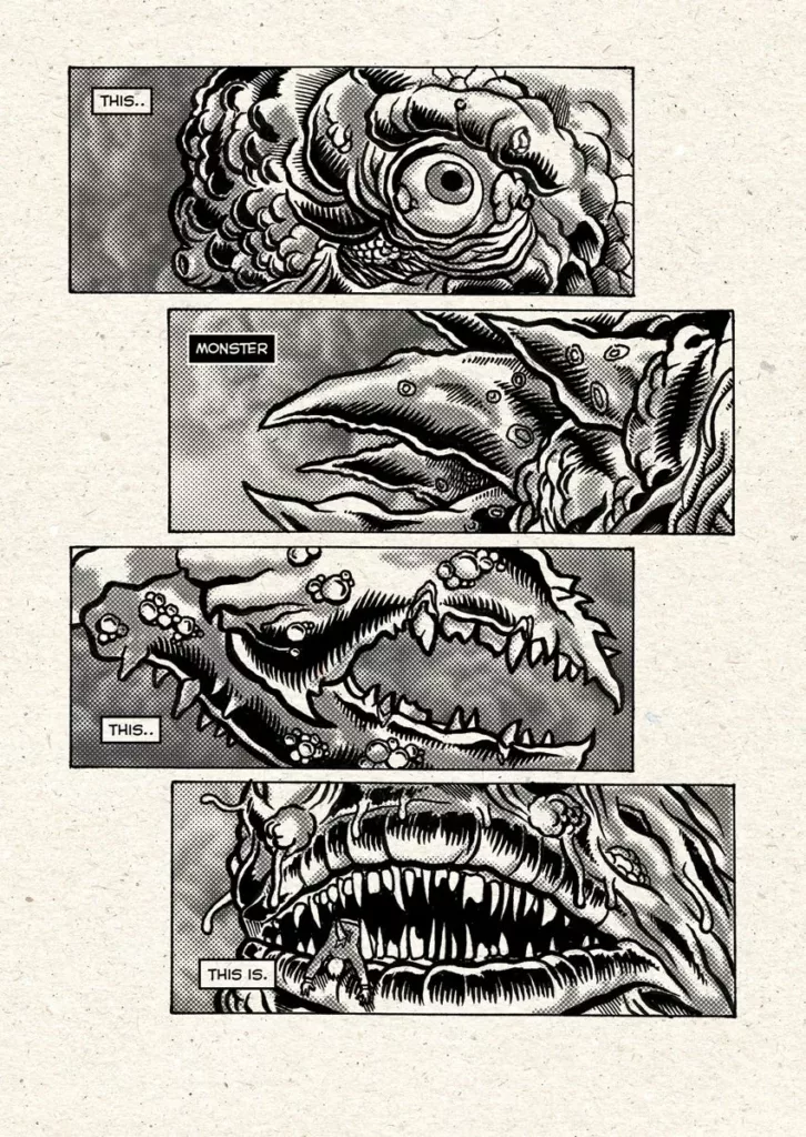
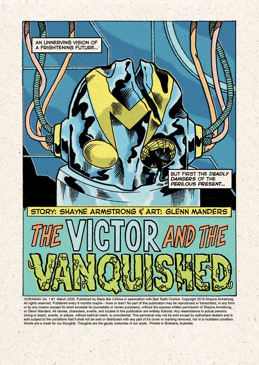
Glenn’s art is amazing – it has a unique vibe, sense of movement, beautiful line work, realistic shadows and intricate details. As a result, the comic looks great and the battle scenes are EPIC!
However – There is an obvious aesthetic clash in the appearance of the human characters compared to the monster, the villain and even the backgrounds.
With the monster, villain and backgrounds being depicted in full detail, whilst the human bystanders are rendered in a half finished, undefined and even naïve style.
We can’t say for certain why this is… but no matter the reason – the clash in aesthetics is visually interesting and not something usually seen in comics. You’ll either love it, or hate it.
Internal pages from Horaman No. 1
The Paper and Print
For a comic printed via standard laser printing, on standard paper the print quality is flawless.
The pages are thick and easy to turn, colours are crisp and there is no bleed in any of the line work.
Additionally, some of the comic’s pages are made to look as if they are made out of vintage paper stock – a great affect that really adds to the comic’s vibe.
Plus the heavy stock cover is a nice touch.
Summary
When viewing Horman No. 1 as a whole: the 20-page narrative, as well as the 12 pages made up of retro styled advertisements, a pin-up gallery featuring depictions of Horaman by a slew of amazing artists – namely Raymond Salvador, Jordan Lewerissa, Jonathan McBurnie and JB Roe – and a character explanation written by Shayne; Horaman No. 1 is a perfectly realised object.
A loving post-modern tribute to Japanese masked heroes from the 1960s and 70s such as Ultraman and Kamen Rider, 1980’s horror comics such as Swamp Thing and cyberpunk manga such as Akira.
That said, when the 20 pages of narrative are viewed alone, the tale seems lacking and the reader is left wanting more. More character development, more story and importantly more pages for their investment of US$7.
In summery – Horaman No 1 is a beautifully realised object, with a mixture of beautiful and naïve art, housing a fairly cliched superhero vs monster battle.
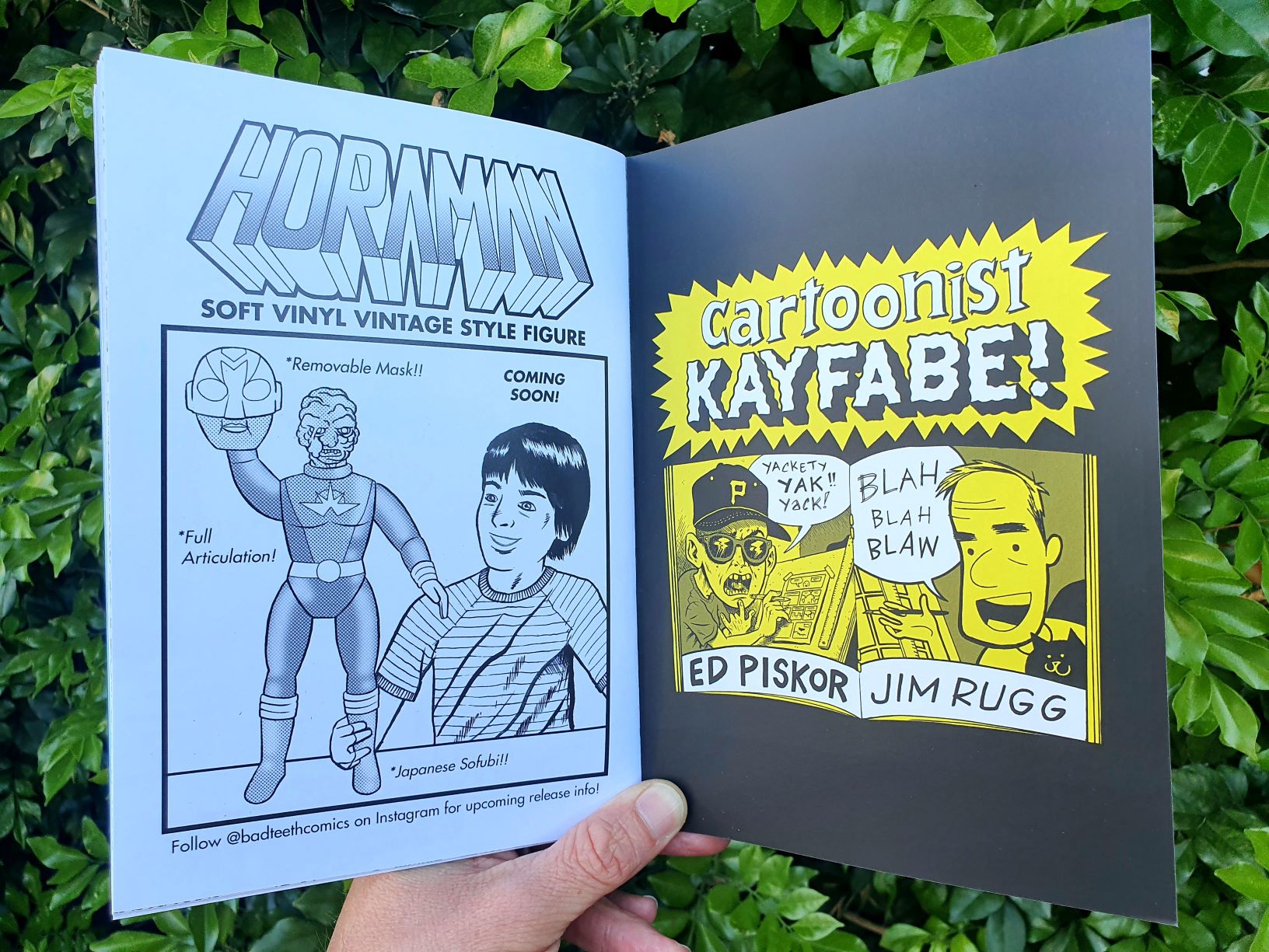
Interestingly, an advertisement on the last page of the
comic, for an upcoming Horaman sofubi figure may reveal the true goal of the
comic – to act as a teaser for an upcoming toy!
To find out – we shall have to wait and see.
P.S: Here, I must acknowledge some bias and state that whilst I love reading comics, I don’t really collect them as objects. Nor do I ever really purchase single issues – instead preferring comics that tell a whole tale, such as trade paperbacks and graphic novels, as opposed to single issues that only hint at, or form part of a larger narrative.
Links
- Bad Teeth Comics – Website: https://www.badteethcomics.com/
- Bad Teeth Comics – Online Store: https://badteethcomics.bigcartel.com/
- Bad Teeth Comics – Instagram: https://www.instagram.com/badteethcomics/
- Bad Teeth Comics – Facebook: https://www.facebook.com/badteethfanpage/
- Shayne Armstong + SP Krause – Blog: https://armstrongkrause.wordpress.com/
The Aither Comic Review logo art by Australian artist and designer John D.C
![Comic Review – ‘Horaman No. 1’ from writer Shayne Armstrong and artist Glenn Manders [Black Bar Comics X Bad Teeth Comics, 2020]](https://theaither.com/wp-content/uploads/2020/04/Horaman-1-Photo-of-Comic-Cover-Med.-jpg.webp)
![Comic Book Review – ‘Her Frankenstein’ by Kawashima Norikazu, English Translation by Ryan Holberg [Smudge, 2024]](https://theaither.com/wp-content/uploads/2024/07/Header-Photo-crpd-sml-221x264.jpg)
![Zine Review – Venomous Feathers No. 1: Edited by Fergus Nm [Venomous Feathers, 2021]](https://theaither.com/wp-content/uploads/2022/03/IMG_1211-cropped-jpg-277x264.webp)
![Book Review – ‘Neo-Decadence Evangelion’ an Anthology Edited by Justin Isis; Featuring Brendan Connell, Golnoosh Nour, Arturo Calderon, Gaurav Monga, Audrey Szasz, Colby Smith, LC von Hessen, James Champagne, Kristine Ong Muslim, Damian Murphy, and Justin Himself [Zagava Books, 2023]](https://theaither.com/wp-content/uploads/2024/03/NGE-Cover-363x264.jpg)